- Developers
- Developer Blog
- Web and Mobile Development
- How to Design the Perfect Mobile App Icon?
profile

By Aran Davies
Verified Expert
9 years of experience
Aran Davies is a full-stack software development engineer and tech writer with experience in Web and Mobile technologies. He is a tech nomad and has seen it all.
Interested in exploring the perfect mobile app icon design? In this article, we will discuss how you can design the ideal icon for your mobile app.
In this article
- Why Is Mobile App Icon Design Important?
- 13 Tips for Mobile Icon Design
- Frequently Asked Question on Mobile App Icon Design
The mobile app landscape is vibrant and innovative. However, a Localytics report shows that 21% of users abandon an app after using it only once.
There are many reasons for app abandonment. Unfriendly UX is certainly one of them, as you can read in “Understanding Why Users Abandon Apps”.
Why Is Mobile App Icon Design Important?

Mobile app UI/UX design has very specific requirements, and I had earlier written about them in mobile navigation menu examples. Mobile screens are small, therefore, designers can’t use too much text to describe an app’s function.
Designers must convey the functionalities and features of the app working within the screen space constraint. This makes the mobile app icon design very important.
Icons can communicate the feature to users without using labels that take up space. This consideration is the same for the mobile app icon, i.e., the one that users see in the app stores even before they download the app.
However, designing icons requires a delicate balancing of many factors. The mobile app icon design must be original. Plagiarizing icon designs from other apps is certainly an unethical practice.
However, app users all over the world must also easily understand what the icon conveys. This means that the icon can‘t be an uncommon one. Mobile app users are in a hurry, therefore, no one wants a learning curve about icons in the app.
The design of the icon should also correspond to the use case of the app. Different apps may have different use cases, e.g., mobile payment apps are completely different from music apps.

Get a complimentary discovery call and a free ballpark estimate for your project
Trusted by 100x of startups and companies like
Users expect to see different UX presentations in these apps. Icons should match the basic idea of the app. These complexities make it imperative for UI/UX designers to pay special attention to the design of icons.
13 Tips for Mobile Icon Design
Next, let’s see some important tips to consider when designing a mobile app icon.
Tip #1 to design icons for a mobile app: Restraint in design
To start with, you need to set some ground rules when you design a mobile app icon. You need to confine your design within some self-imposed constraints.
This could be done in various ways. For e.g., you may want to stick to basic shapes. Another constraint could be that you will work with weak colors only, e.g., white.
On the other hand, you may choose to work with flat shapes. Another constraint could be to avoid using gradients. Among many custom icon design tips, this is an important one. This approach allows for simplicity.
Designing the first version is quick when you work with a few basic shapes and colors. This also enables you to make changes easily. Read more about this tip in “You don‘t need an icon designer or even Photoshop”.
Recognizable icons: Advice #2 for designing icons for a mobile app
This advice is important for all icons in the mobile app, however, for the app icon, it’s the most important point to remember. This is because the role of app icons starts even before users download the app and start using it. App icons clarify the key functionality of the app to its prospective users.
There are several ways to know how recognizable the icon is. The most important of them is a test: do people remember the icon after the lapse of some time, for e.g., a day? If they still remember it, you have designed an easily recognizable icon.
However, whether users remember that icon also depends on the functionality and category of the app. Human beings expect certain kinds of symbols for specific purposes. Study apps that offer functionalities like your app will do. Check their icons and try to use a similar kind of icon.
However, uniqueness is also important to make your icons recognizable. You need to strike a good balance between using known icon patterns and introducing uniqueness. Read more about this aspect in “7 handy tips for better app icon design”.
Memorable icons: Tip #3 for a mobile app icon
This advice is also equally important for icons describing functionalities in the app and the app icon itself. It‘s also a bit related to the advice regarding a recognizable icon.
A memorable icon makes it easy for the user. Users will remember the icon and associate it with the functionality of your app. When they want to launch the app next time, the memorable icon will enable them to find it easily. This increases the chance of retaining users.
To know whether you have designed a memorable icon, show it to someone for a short amount of time. Then, ask the viewer to sketch it quickly. If the user can easily sketch the icon, your icon is memorable. Read more about this aspect in “Eye-catching app icon design: how to”.
Tip #4: Take design inspiration from relevant apps
Communicating the overall functionality of your app and subsequently communicating its features can be hard. It’s always a good idea to take inspiration from relevant apps that offer the same functionalities as your app.
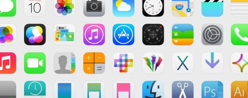
For a well-curated list of popular app icons, read “28 awesome app icons for inspiration”. There are other similarly curated lists, for e.g., 33 stunning iOS app icons designs is one.
Custom icon design tip #5: Use the right tools
You need the right tools to design a mobile app icon or a mobile app logo. Check out the following options:
- designapp.io: This is an easy-to-use graphic design tool. You can create icons for your Android and iOS apps. The app offer design templates, additionally, it offers many fonts for your use. There are free design elements available. You can also play around with their color palette and use various design effects. It‘s a free app.
- MakeAppIcon: This is a tool to resize your icons. You can upload images to resize the icon. The version with this basic functionality is free, additionally, they have a premium version.
- Adobe Photoshop: This hardly needs an introduction. You are likely already aware of the powerful icon design capabilities this app offers since they are an established market leader.
Simple design: The 6th tip to design an app icon
A simple design can be pleasing to the eyes. On the other hand, a complex design can often confuse users. It‘s an accepted principle in business that if you can‘t communicate your product in simple terms then you will most likely not sell too much of it. The same principle applies to mobile app icons.
Hire expert developers for your next project
1,200 top developers
us since 2016
However, I have a word of caution. You need to strike a balance. Infuse simplicity in your app icon design, however, don‘t compromise on the recognizability and memorability of the icon. The icon should communicate the information users need, when they need it, and in a straightforward way.
Read “Why simplicity is so incredibly important in UX design” to know why your app icons should be simple enough to blend in with your UX.
Size-neutrality: The 7th principle of a mobile app icon design
The app icon you design should look good irrespective of its size. Note that different platforms, even different devices, have different icon size standards. You need to test your icon and ensure that the recognizability, memorability, and simplicity of the icon are retained irrespective of the size.
Read more about this in “Choosing the Right Size and Format for Icons”.
Consistency with the overall UX design: The 8th tip for graphics design of an app icon
Users of your app shouldn‘t feel that the overall UX design of the app and the icons in it represent different worlds! Your brand shouldn‘t come out disjointed from the app icon. The icons inside the app should blend in with the UX design seamlessly.
The icons should use the same color palette like the ones used in the UX design. Any deviation in this will result in a confusing user experience. Both should match your branding style.
How you use symbols in the icon should fully match how you use them in the UX. This provides a coherent user experience. Users will not have to balance two contrasting messages, and your user retention will increase.
Consistency is important in icon design, however, it‘s also very important in UX design. Read more about it in “Consistency — A key design principle”.
Platform-specific icon design: The 9th principle
Android and iOS are the two most popular platforms and they are quite different from each other. The devices for each platform deal with features differently. When learning how to design an Android or iOS icon, you need to keep in mind the platform-specific characteristics.
If you design icons without factoring in these differences, your users will notice a visible mismatch between your icon and the mobile platform. This creates confusion in their mind, therefore, they will likely shop around for apps they find easier to use.
UXMISFIT.COM provides a useful checklist for this purpose. You can use it to design icons while factoring in the platform-specific characteristics. You can buy this checklist here.
Your app designers and developers should refer to human interface guidelines for Apple iOS apps and material design guidelines by Android when designing interface elements for Android apps.
Icons that work against multiple backgrounds: The 10th designing tip
A mobile app will likely have multiple screens. These screens might have varying background color schemes. The icons within the app should look equally good on all the screens.
You need to avoid transparency in icon design since some background may make it hard for users to find icons. There is no straightforward way to ensure that the icon works equally well against all background colors. You need to test it thoroughly.
Utilize established icon/functionality associations: The 11th mobile app icon designing tip
With the increased maturity of the web and mobile ecosystem, many symbols have become associated with certain functionalities.
Consider the envelope symbol indicating an email app. Another example is the triangular arrow for video and audio players.
There are many other such powerful associations of symbols to functionalities that are instantly recognizable by the users.
Hire expert developers for your next project
Security features are commonly expressed using the lock. Productivity improvement tools such as calendars often use a tick mark to communicate their main functionality. Apps for creative pursuits often use a pencil or paintbrush.
These are now established symbols. When users see any of these, they immediately know the functionality this app will offer. This makes their search for apps easier.
When thinking about how to design a mobile app icon, consider using these established associations. You will find it easier to communicate the main functionality of the app this way.
Read more about it in “5 huge trends in app icon design”.
The 12th advice: Sufficiently differentiate your icons
You might often find that icons for different functionalities look similar. This can be due to several reasons. For e.g., an activity monitor icon and a terminal console icon may both use a terminal as their main symbol. This can confuse users.
Avoid this kind of confusion. There’s no easy way out. You need to thoroughly think through the functionality of your app and find differentiated ways to express that in an icon.
Limit the number of symbols in an icon: The 13th tip for mobile app icon design
By its very nature, mobile app design always has space constraints to deal with. Well, the very utility of an icon is to communicate the central idea with a symbol without accompanying texts. It goes without saying that icons can only take up a small amount of space on the screen.
If a designer tries to fit in too many symbols within this limited space, then the result will be a cluttered icon. The main objective of communicating the central message will be defeated. Guard against this temptation. Read more about this and similar principles in “7 principles of effective icon design”.
Planning to Develop and Design Your Business App?
Mobile apps are a sure way to reach a wider audience in less time given the number of smartphone users today. They help to deliver a personalized user experience that in turn also increases user engagement and user retention.
However, designing a mobile app that stands out in the sea of apps available on the Android Google Play Store and Apple App Store calls for exceptional mobile app design and development expertise. If you, as a business CEO or CTO, do not find such professionals on your project team, try engaging an experienced software development company.
DevTeam.Space can help you here with its expert mobile app developers community experienced in designing and developing robust, secure, and yet user-friendly mobile apps.
Contact us by stating your initial mobile application design and development requirements via this form and one of our technical managers will get back to you for further assistance.
Frequently Asked Question on Mobile App Icon Design
A simple design with vibrant colors, unique shapes, avoiding text, etc. makes a great app icon for your mobile app.
It is a graphic that helps identify your app. It is the first thing about your app that users see in the app store along with other similar apps while downloading it.
Focus on relevance, unique app icon, keeping it simple, choosing the right colors, and including branding are the five rules for a good mobile app icon design.

Alexey Semeney
Founder of DevTeam.Space
Hire Alexey and His Team To Build a Great Product
Alexey is the founder of DevTeam.Space. He is award nominee among TOP 26 mentors of FI's 'Global Startup Mentor Awards'.
Alexey is Expert Startup Review Panel member and advices the oldest angel investment group in Silicon Valley on products investment deals.


