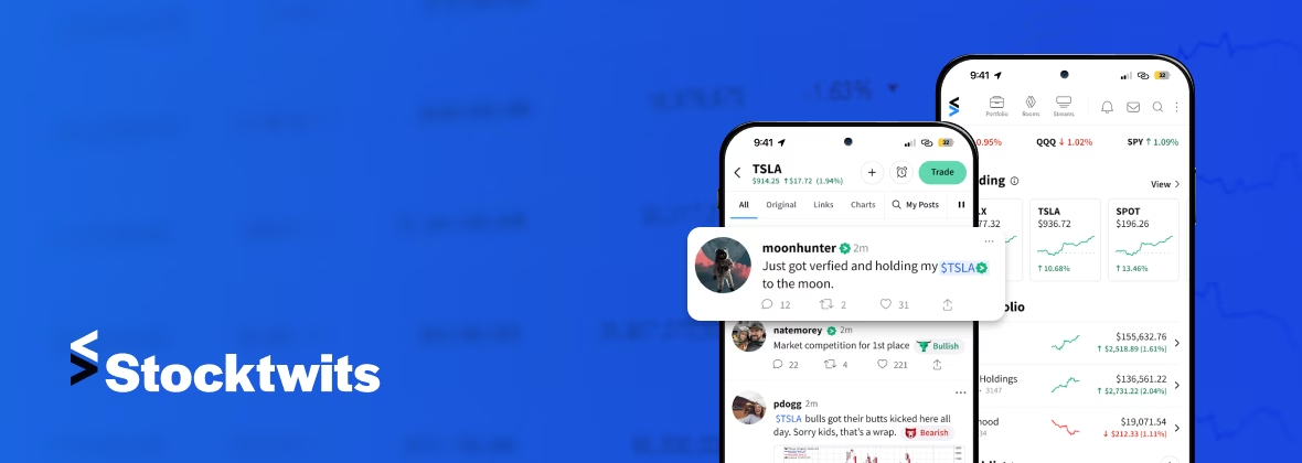
Major revamp of a fintech application that skyrocketed the app's user base to over 1M.
Client
StockTwits is a social media platform created specifically for the investing community. It lets traders and investors share their thoughts and insights about the stock market in real-time. The platform offers users the ability to track specific stocks, watchlists, and market trends. It serves as a hub where users can exchange ideas, strategies, and news, encouraging a more efficient approach to investing and financial analysis.
Challenge
StockTwits faced a challenge: their Android app design and functionality were not in sync with their iOS and web counterparts. This resulted in a poor user experience due to outdated icons, a cluttered watchlist, an inefficient signup process, a confusing direct messaging feature, etc. Moreover, the app navigation process and overall user interface aesthetic did not meet users' expectations when compared to the iOS version.
Solution
The solution involved two phases, each targeting specific issues that had to be overcome to enhance the overall user experience and app functionality. In the short first phase, DevTeam.Space carried out a UI/UX overhaul of their Android app. This phase primarily focused on improvements to align the app's design with the iOS version of the app. This included adjustments to fonts and headers, changing the iconography, and updating the signup process. The home screen was redesigned, incorporating grid updates, new visuals, and more precise navigation elements to enhance usability.
Furthermore, we refined the watchlist and a single ticker page to enhance user interaction and visual appeal. We simplified the post/tweet screen to improve its readability and appearance. We updated the direct messaging feature to reduce user confusion. Finally, we reworked the main app menu to make the user experience the same as in the iOS version.
Phase 2 required a more in-depth approach and for our engineers to rework the rest of the app. We focused on optimizing performance and rewriting the app with Kotlin to allow for the creation of a clearer project structure. We also implemented a standard architectural approach. This phase aimed to refine functionality and ensure a user experience similar across both platforms. To improve navigation, we introduced a tabbing system on the ticker page that offers an intuitive experience to users. Direct messaging was enhanced with the inclusion of a suggested followers function. We also updated the UI.
Results
As a result of these two phases, StockTwits's Android app has been dramatically improved, bringing it in line with its iOS counterpart, both in terms of design consistency and functionality. The user experience was improved by implementing easier navigation and enhanced features such as the watchlist, symbol page, and direct messaging updates. The new version was released to Google Play and has, to date, been installed by more than 1 million users.
Tags
Development Team
Recommended by 97% of Our Customers
Right provider for complex projects
DevTeam.Space built a custom web portal for a hedge fund. They handled a complex development project, remaining organized and professional throughout. They’re accessible and tackle any challenge. Customers can expect a quick and skilled development team.
Singapore
Talented, responsive and reasonable!
We manage the IT for an almost 100 year old international Not-For-Profit Foundation. Between our inhouse team and DevTeam.Space we made our deadline, and have received overwhelmingly positive feedback from the end-users and management.
New York, NY
DevTeam.Space rocks
We needed a new long-term product development partner to identify the issues, and ideally, take over the entire product. The performance of our shipping platform increased dramatically since DevTeam.Space stepped in. We plan to continue working with them on a long term basis.
Fort Lauderdale, Florida


